Overview
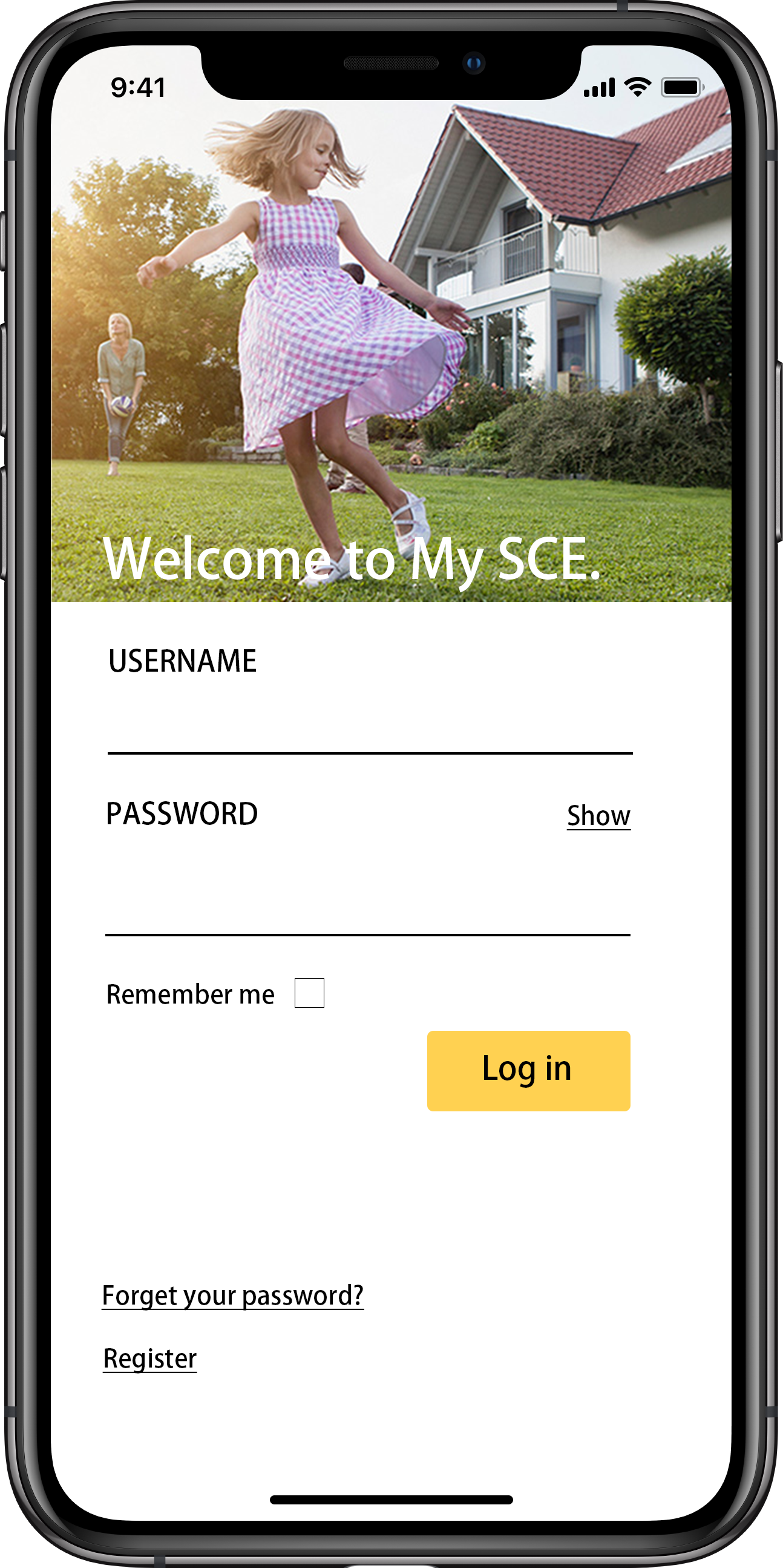
My SCE is a utility app for SoCal Edison. It is mainly used for managing SCE accounts, reporting and checking
power outages,
and finding information about SCE services and programs. My SCE is a fairly simple and straightforward app, and
therefore usable
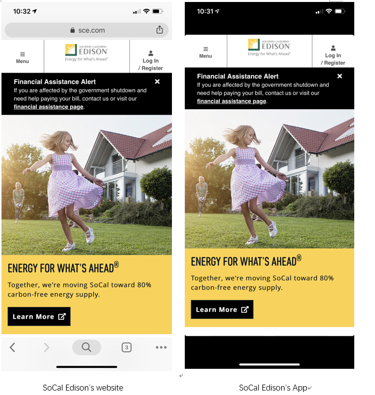
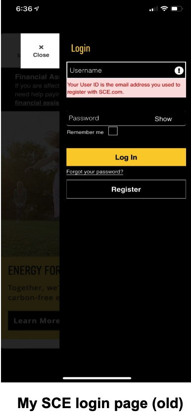
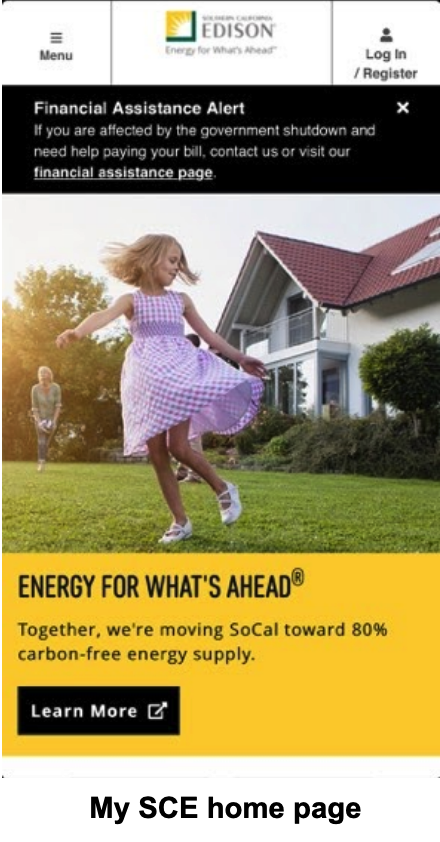
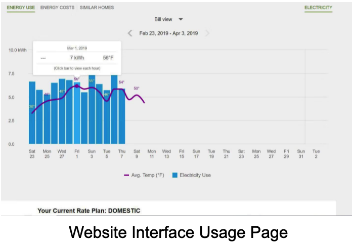
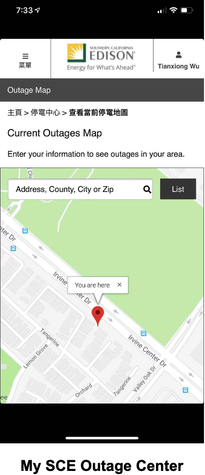
by almost everyone. However, it has a very poorly designed user interface, which looks almost identical to SoCal
Edison’s website.
Design Process

Outcome
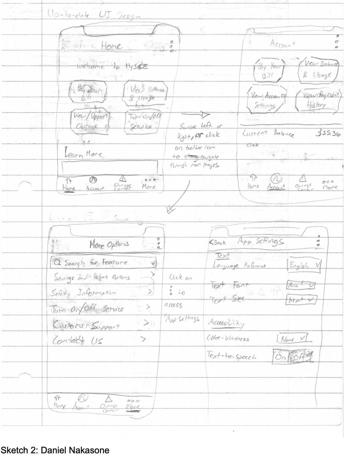
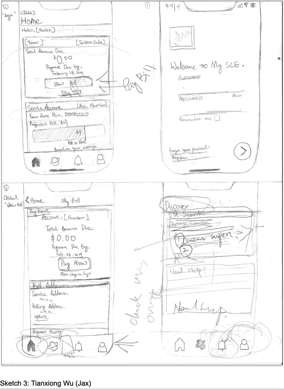
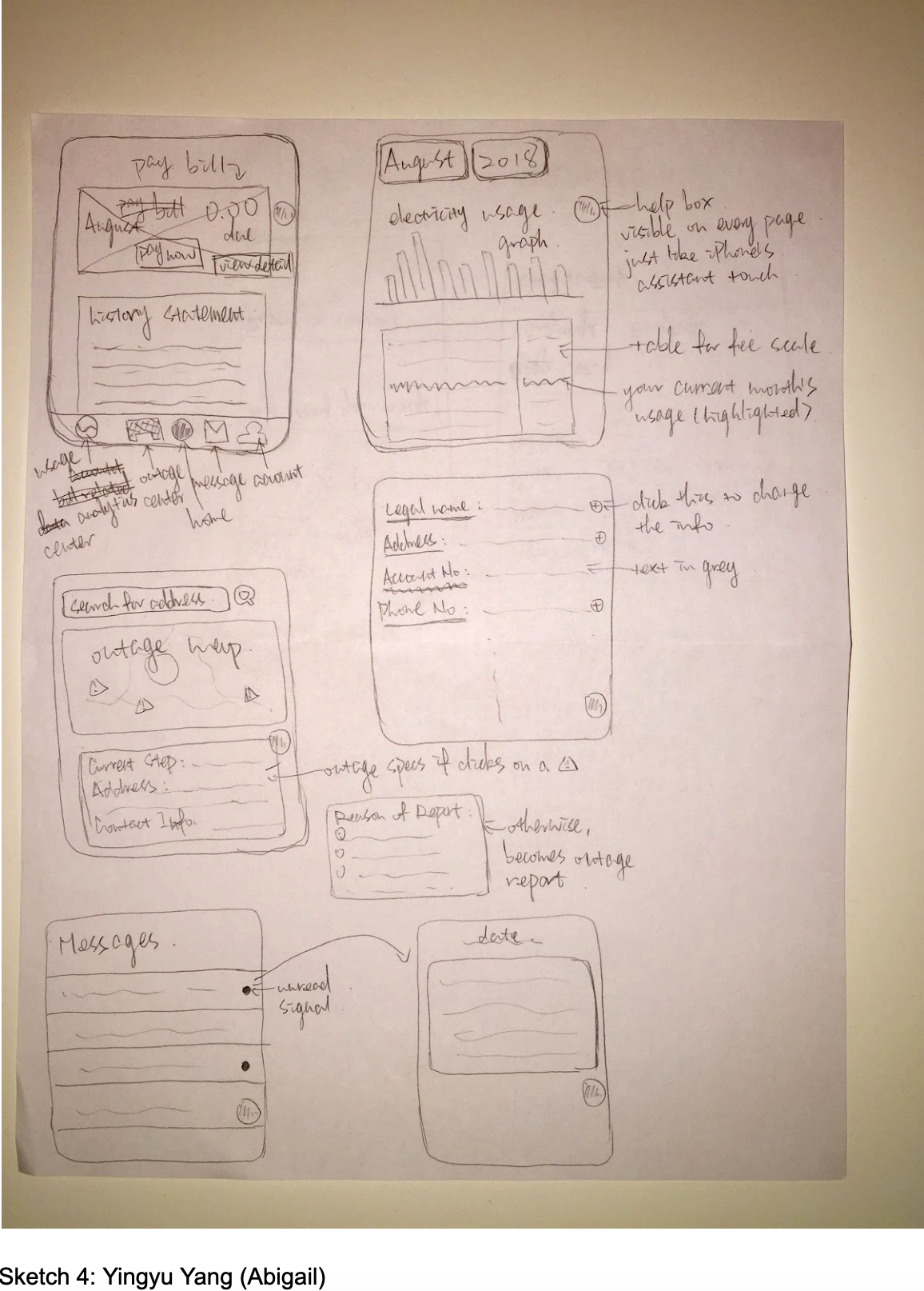
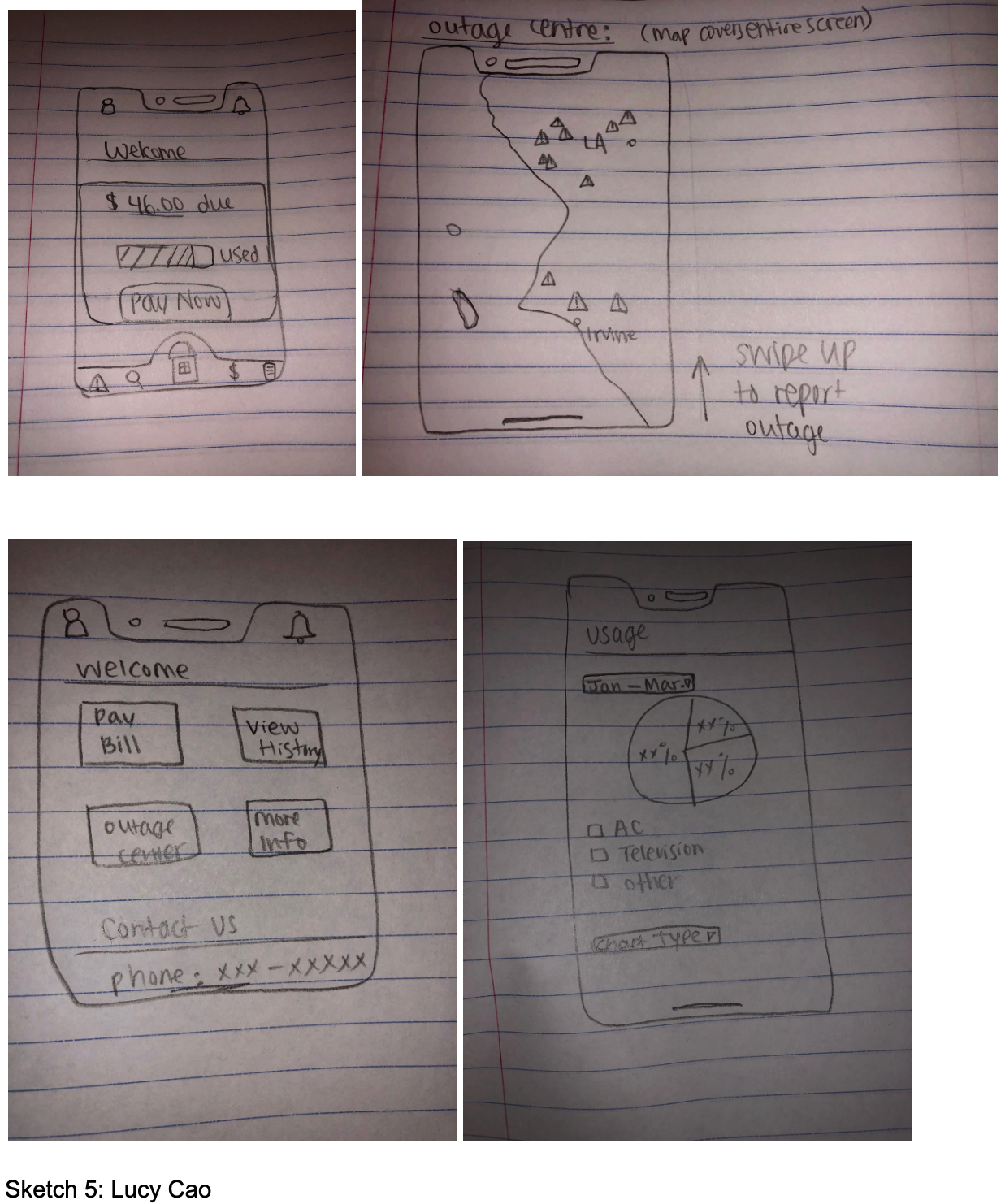
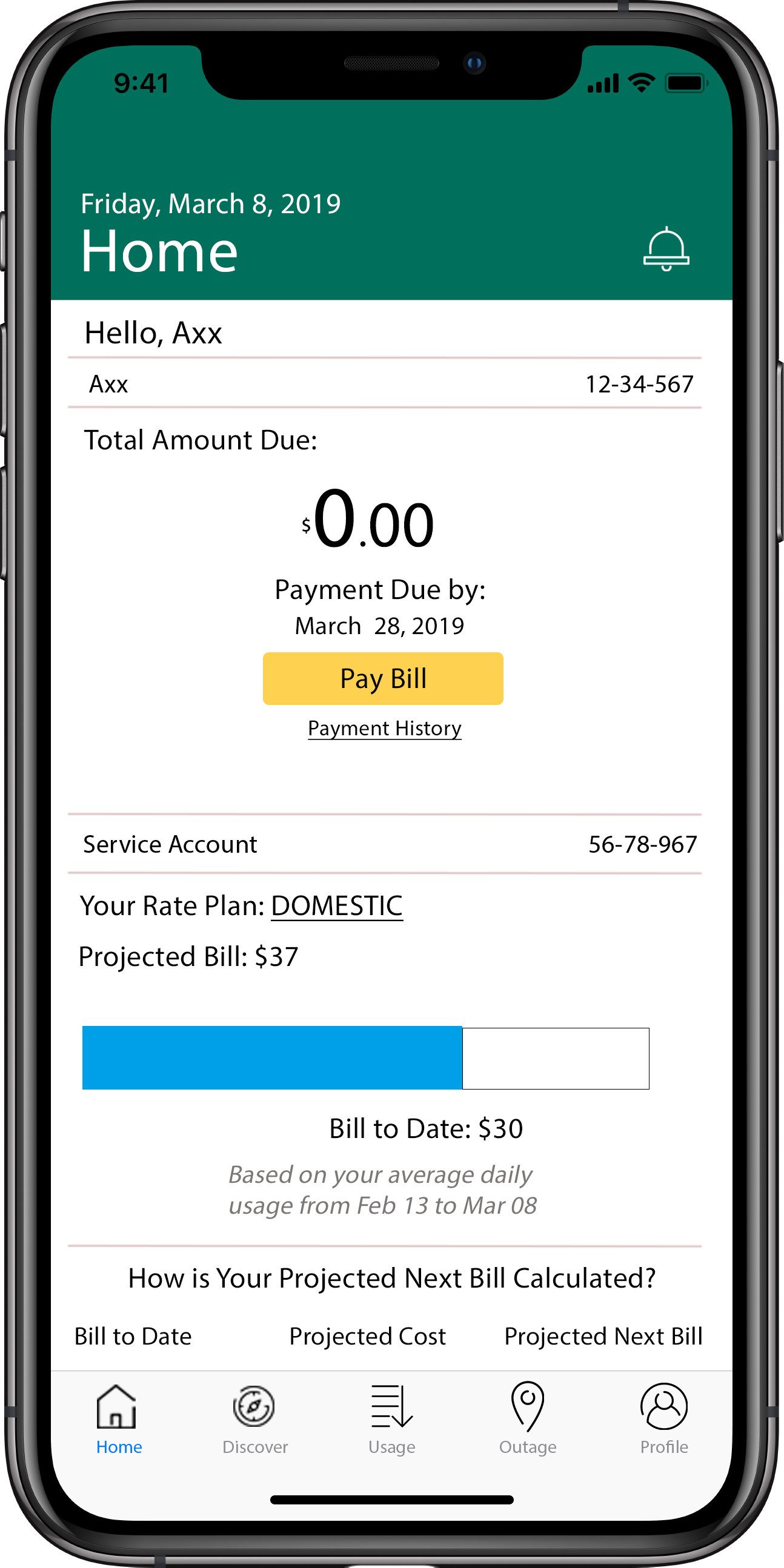
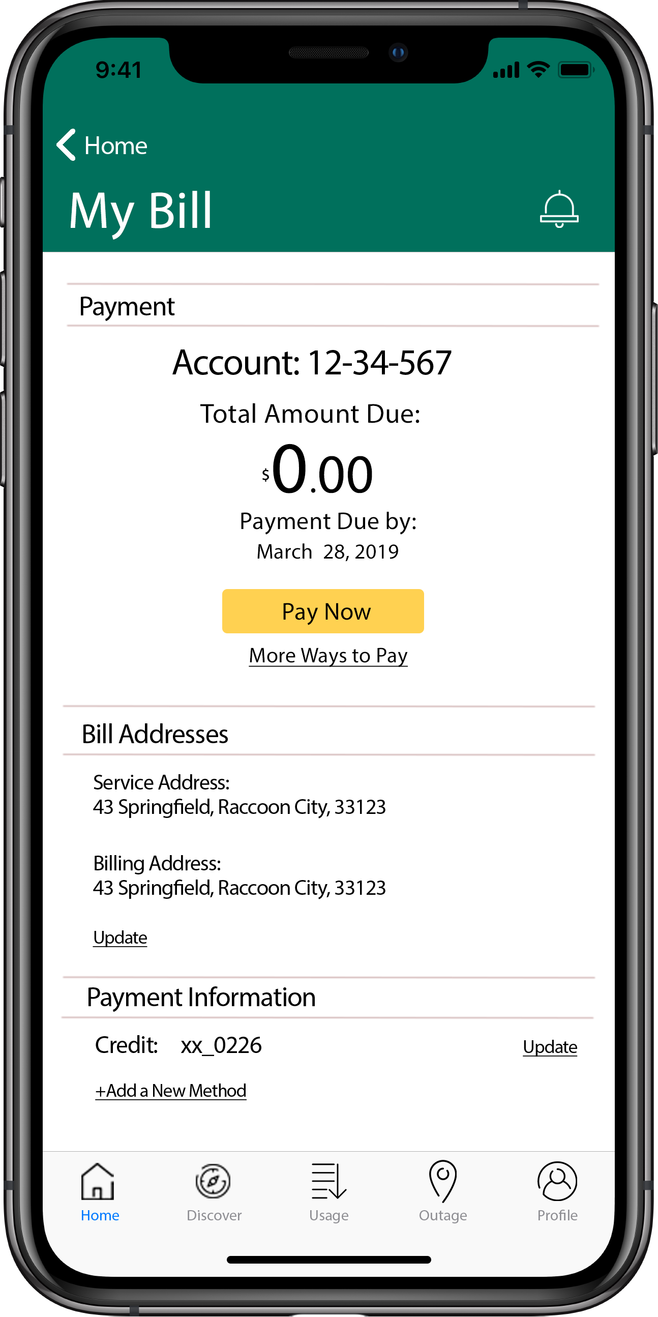
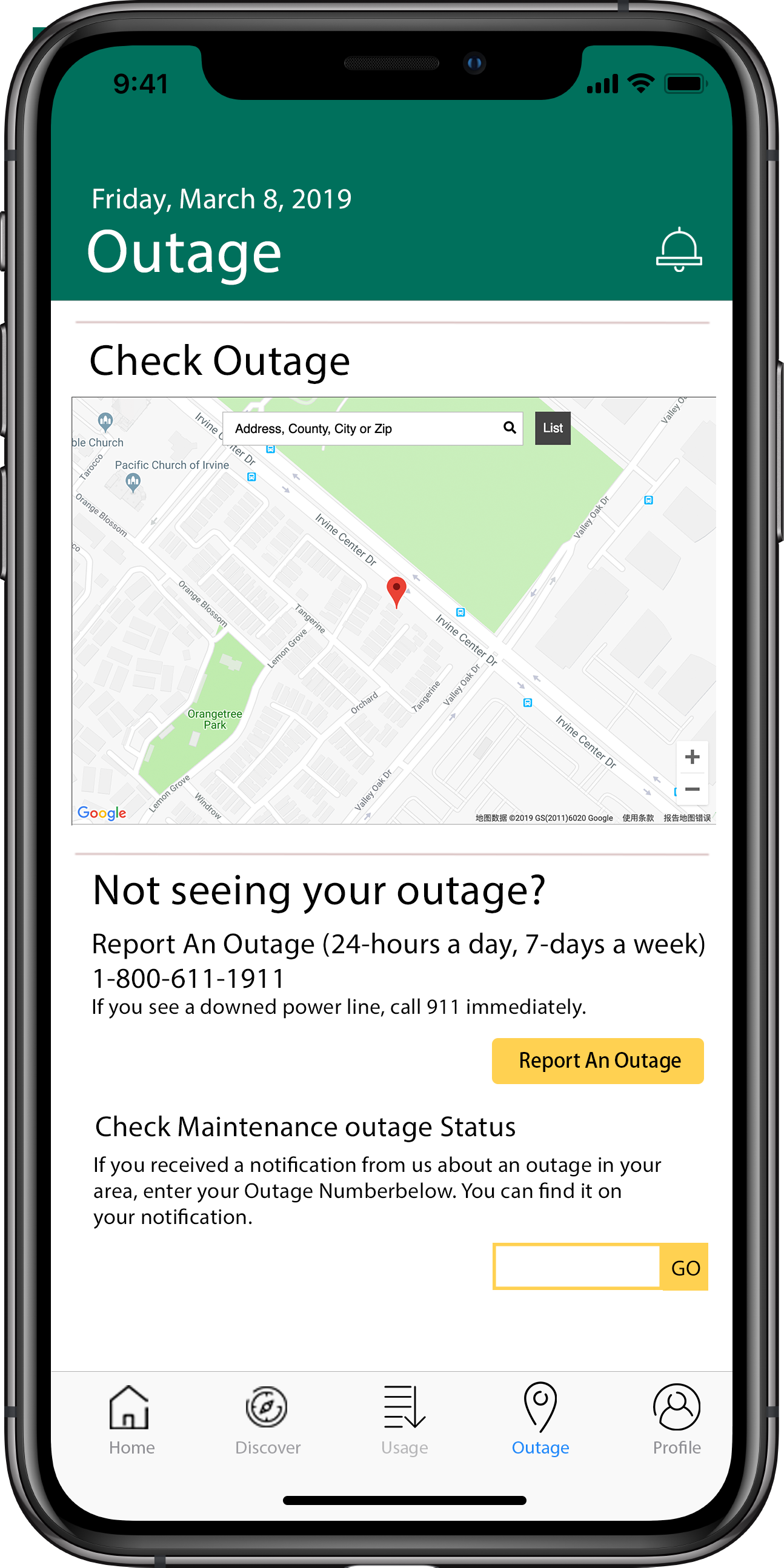
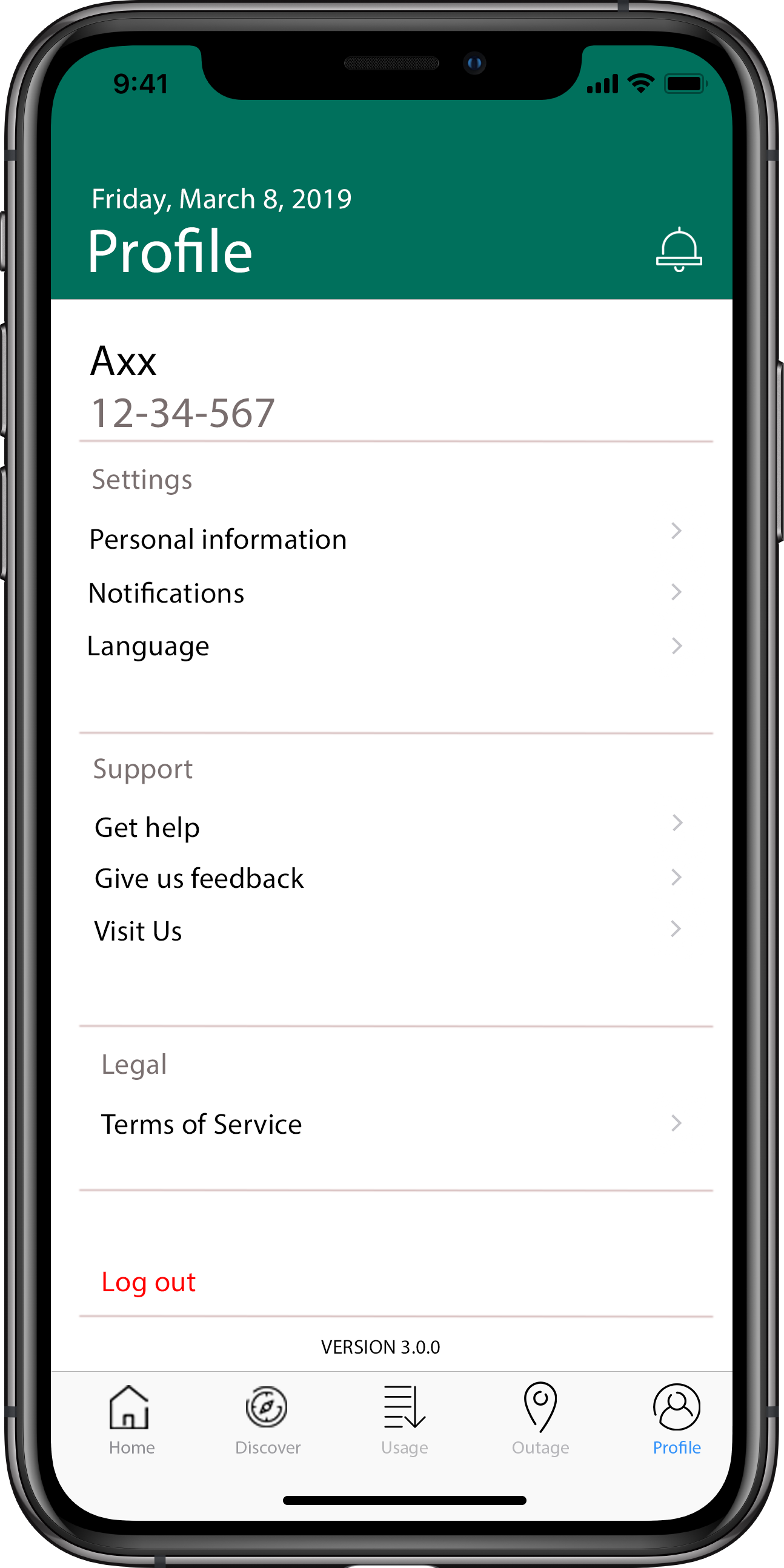
In order to address the problem, we redesigned My SCE as a whole, and focused on its relationship with SCE's
website.
Competitive Analysis
If you want to get a lay of the land before you dive in, and the best way to do that is by looking around
and seeing who else is in the space with you.
---- Professor Bietz
Comparing and Contrasting Market Offerings
We examined four competitors - DWP Rates, SDG&E, SoCalGas, Cox Connect. The main service My SCE and
other
offerings provides is a way for its customers to be able to pay their utility bills through mobile devices and
find information about what services are provided by their utility company.
A common set of functionality between the different electric utility apps includes:
1. Viewing / Paying bills
2. An outage map listing where planned and unplanned outages are
taking place
3. Reporting outages
4. A cost calculator that adds up energy costs from appliance use or
overall energy use
My SCE provides all the information and features found on their main website, while other apps
provide a more simplistic interface, which
provides a smaller set of information. The downside to this approach is the interface mostly copies the
website’s layout, so looking through the information on the mobile app is cumbersome.
Since energy companies service a specific coverage area, the user base for each app corresponds to homeowners
and businesses found in those areas. Southern California Edison, whose app is the main interface we explored,
services electricity to much of Southern California. Other electricity utilities operate in locations where SCE
is not operating. Each utility company has a monopoly over their own territory.
This
means that
even direct competitors don’t overlap customers. That being said, the Southern
California Gas Company (SoCalGas), a gas utility company, offers its services to the same households and
businesses as SCE.
Strengthening its mobile platform is a way for SCE to make itself stand out from the utility apps
while providing modern solutions for its customers to manage and lower their utility expenses.

User Research
Study Objectives
Considering the user base of SCE and its app, we wanted to further understand the relationship between the
mobile
app and utility services. Therefore, we developed the following Study Objectives.
1. How do mobile apps support a certain lifestyle?
2. Are there different expectations for what a mobile app should do versus what a website should do?
(features/characteristics people would like the app to possess)
3. What role does technology play in bill paying and solving utility-related problems?
Research Method
To better understand our target user group, we use semi-structured interviews and a survey as
our methods
to acquire the needed data. As a result, we have 10 interviewers and 42 survey
participants.
We asked questions relating to demographics, mobile app use, and bill payment strategies. The interview
subjects were selected from a group of customers who pay their own utility bills. Since one of our target
population
groups is college students whose age ranges from 18 to 22, our focus
was to find how they pay their bills as well as note their complaints on current payment methods, and
any other problems they encountered while using the services.
Reaching out to our other target population, older homeowners, was more difficult.
Some of our members were able to rely on family members to participate in our interviews, but for the surveys
we didn’t have a
convenient communication channel to reach as many participants as we would have hoped.
Target Population
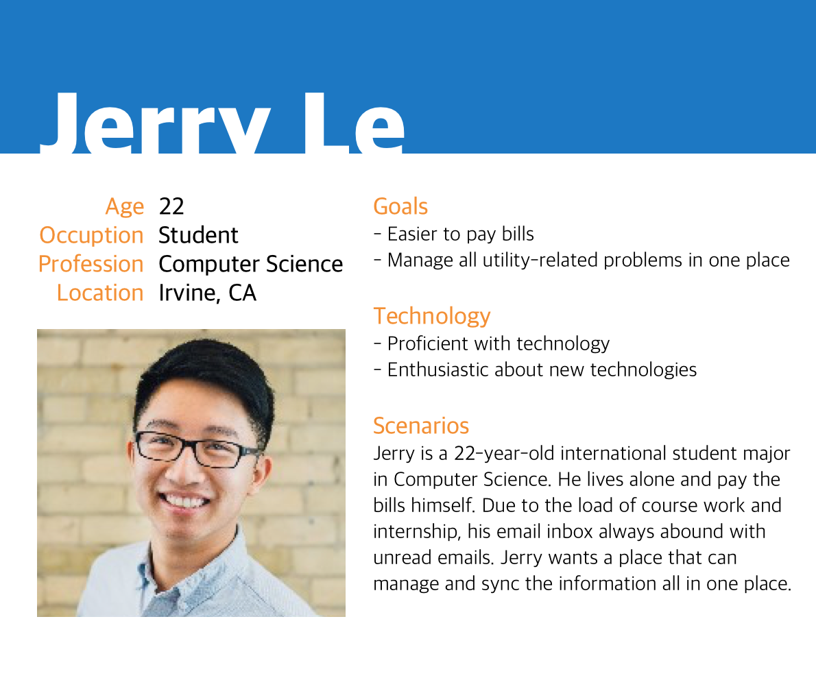
Our main target populations are college students who rent an apartment or a room and working
homeowners.
College Students
Many college students are new to living on their own. This lack of living experience leads to an
unfamiliarity with paying bills.
Their concerns...
I want an easier way to pay bills, like Apple Pay
I Wish I can deal with all utility-related problems in one place
I would like to have an app that notifies me of my bills, usage, etc.
I would like an easier way to contact SCE to deal with outages
Homeowners
Homeowners are generally in a higher economic class than renters. For
older homeowners, some of the assumptions we made when we first selected them as our target
population turned out to be incorrect.
We assumed that they would be less tech knowledgeable, which would impact their preferences in paying
their electric bill. This wasn’t the case,
as our interviewees and survey respondents stated that they were comfortable in using the web or mobile
apps in their daily lives.
Their preference towards the website in particular was
based on the fact that the interface conveniently fit with their lifestyle more than the
mobile platform.
Their concerns...
Be able to quickly access bills and statements
If I could manage Auto Pay on my phone, that would be nice
Have online chat feature so I do not have to call them
Push notifications when the bill is ready
Findings
According to our research on direct and indirect competitors, we have a thorough understanding of where My
SCE as a utility company’s app should focus.
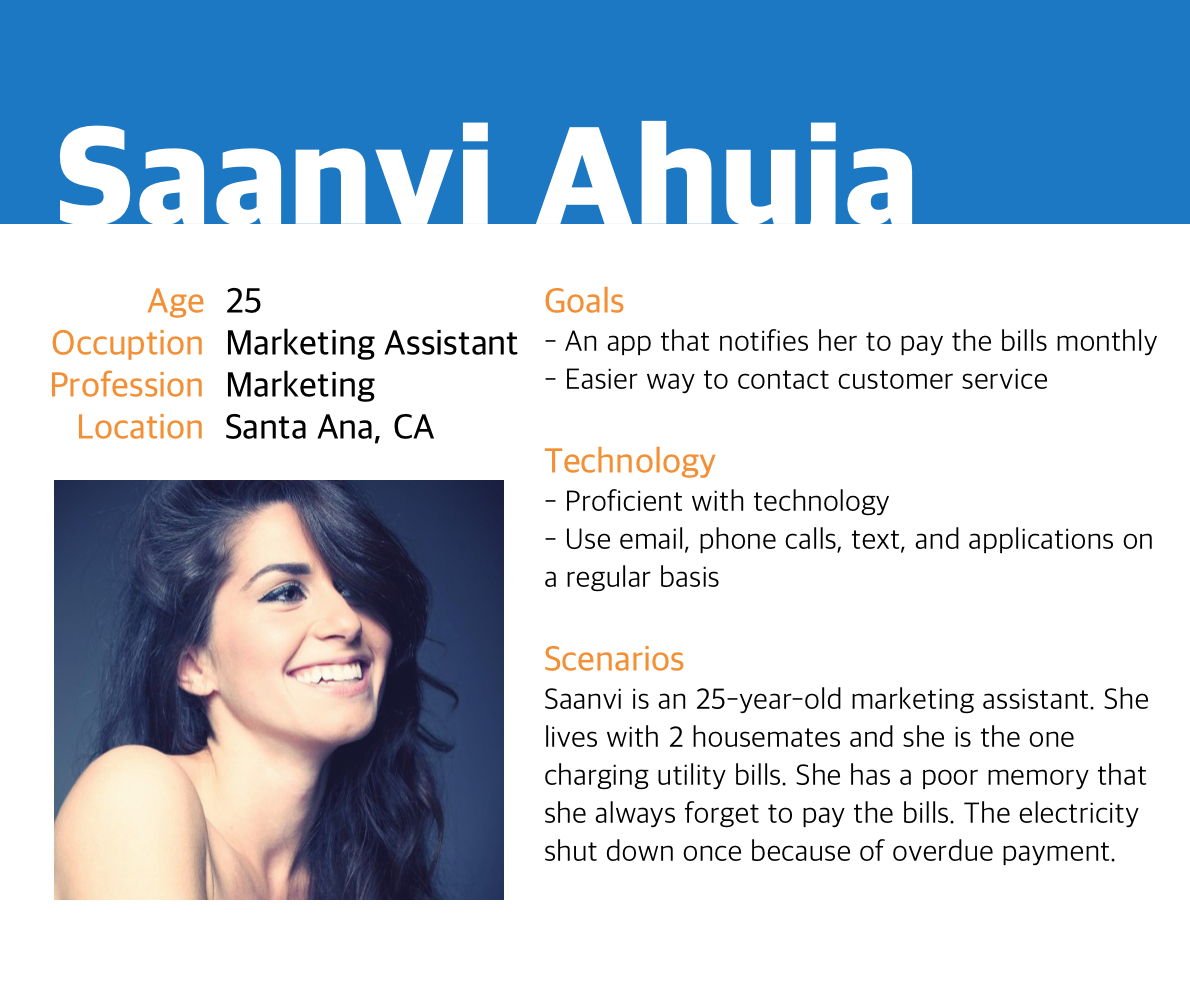
We did find out that some of our users are not comfortable with a subscription payment, and they
inevitably, at least sometimes, missed the payment due, which can lead to overdue penalization fee or even
utility shut downs.
In this situation, having a reminder feature is preferable for those people who tend to forget to
pay bills on time.
Another interesting finding is that in the younger male demographic group, interviewees and survey
takers would like to have the option to use modern online payment methods rather than credit cards.
They listed Venmo and Apple Pay for preferred payment methods.
In addition, A common quality that both of our target populations wanted to see was an interface that was
both easy and convenient to use.
Students wanted to see a well-designed mobile app where they could pay bills or deal
with emergencies since they’re always moving from one place to the next and don’t always have access to a
computer.
Older participants favored the use of a website
because it was convenient to use with what they were already doing at work or at home.
Ideate
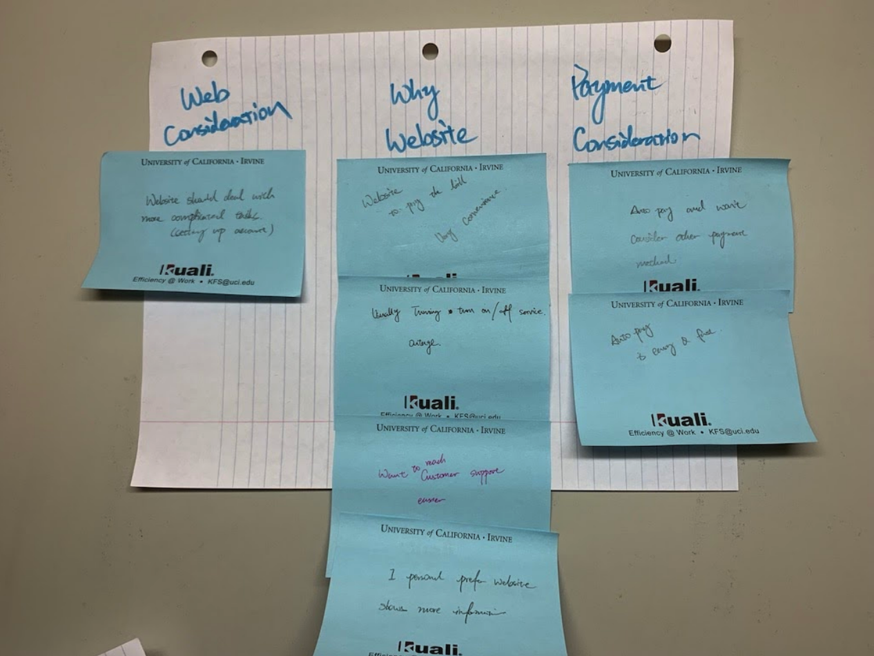
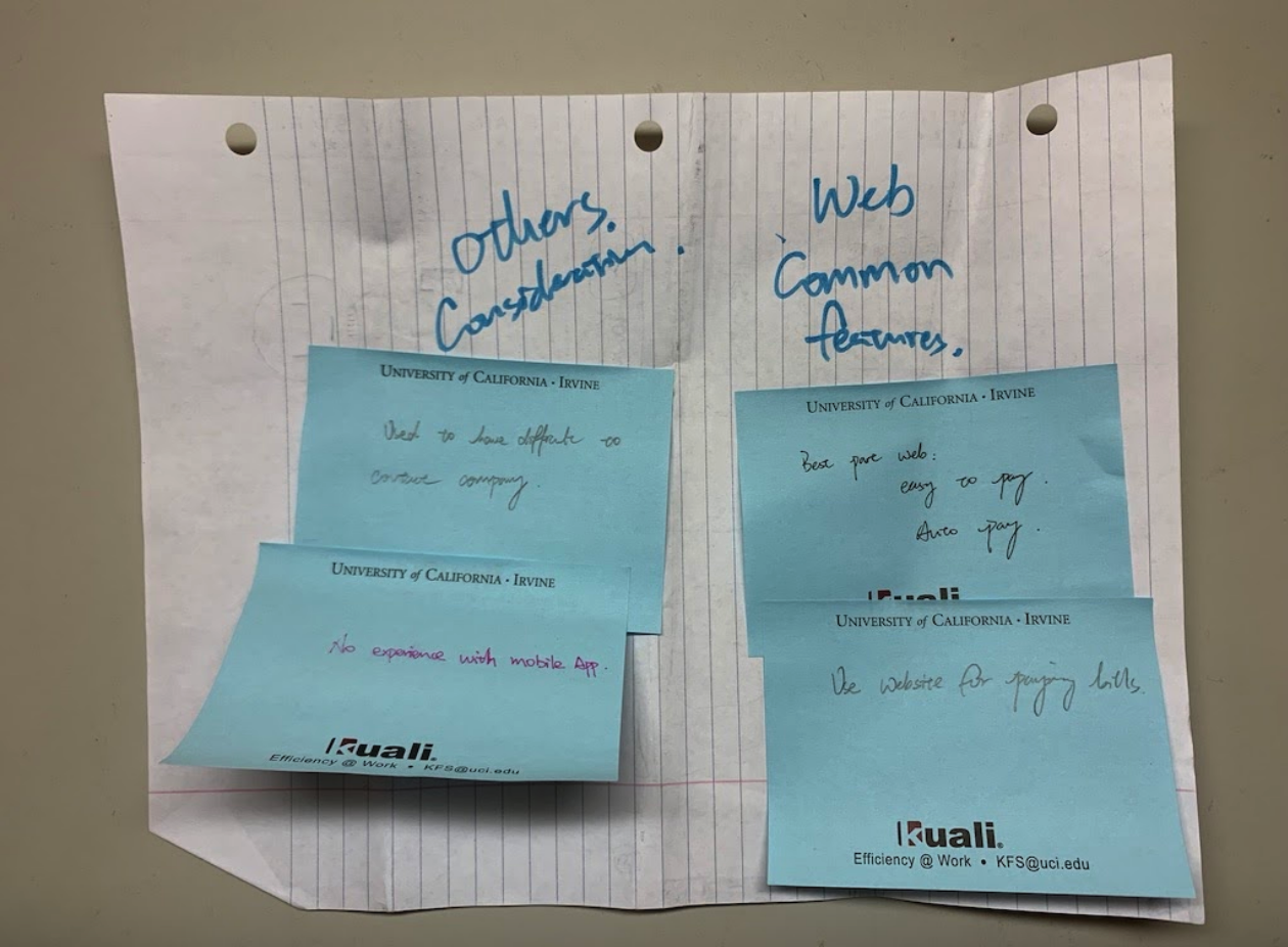
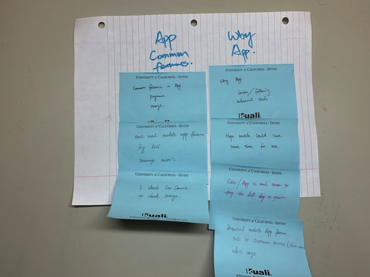
After conducting interviews, I transcribed the results and created the Affinity Diagram that
contains
all
the pain points,
desires, and their prior experiences of using utility apps.
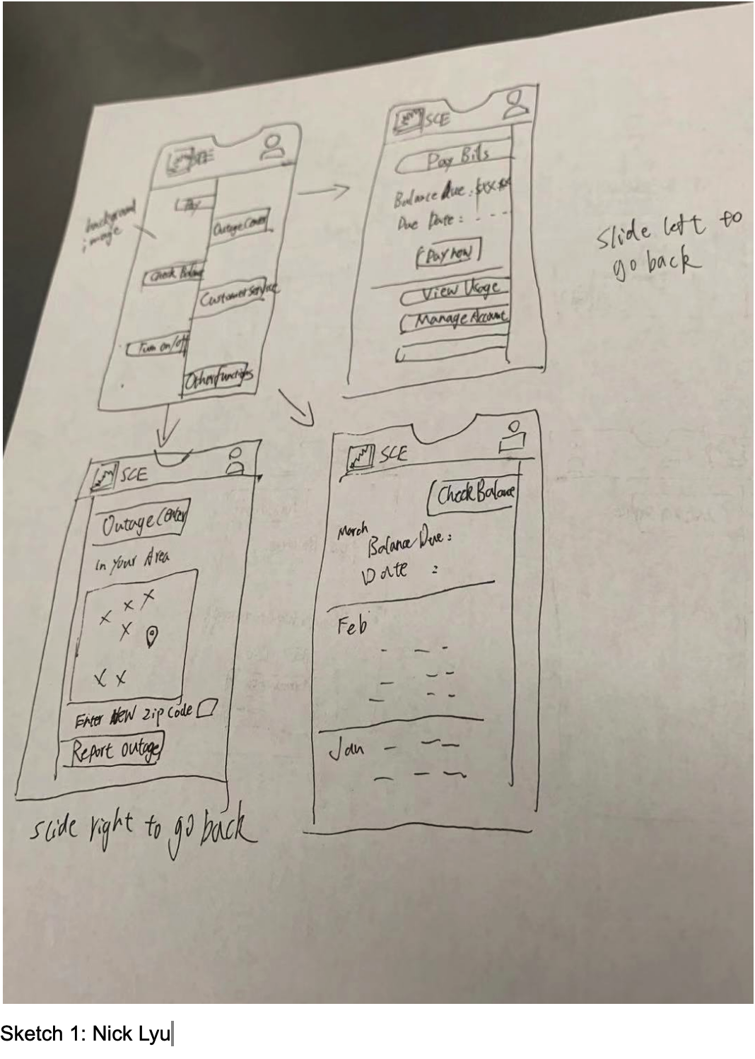
This helped us to organize our thoughts and notes, and also gave me the initial redesign idea.
Personas
Usability Issues
Methods
We conducted usability tests and Cognitive Walkthrough to acquire the information that we needed.
Usability Tests
For the usability tests, the participants were given five tasks to complete in the My SCE application. The
participants of the usability tests were friends / classmates who had the time to assist us in our user
research.
Each usability test took about 20 minutes, accounting for both the usability test and the follow-up questions
and discussion.
Participants were asked to complete the following tasks while thinking aloud:
1. Pay electric bill for this month
2. Find customer service information
3. Check power outage in a certain area (via zip code)
4. Change first name
5. Report power outage for home or business
Cognitive Walkthrough
The cognitive walkthrough involved every member of the redesign team, each member an expert user of the app,
and sought to uncover usability issues in the UI. For the cognitive walkthrough, the redesign team analyzed
three key tasks to identify potential usability issues:
1. Change user’s first name
2. View payment history for the month of February 2018
3. Use search function to find bill statement
Findings
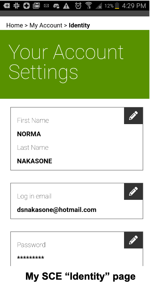
Signifier and affordance mismatch
In one of the tasks in the usability test, participants were asked to change the displayed name of the
electricity account. Through this task, we found some problems with the signifier for the account management
feature.
The correct signifier for Account Management is bound to the wrong affordance
(Account Services button), and the wrong/unclear signifier (Identity button) is bound to the
correct affordance.
False signifier
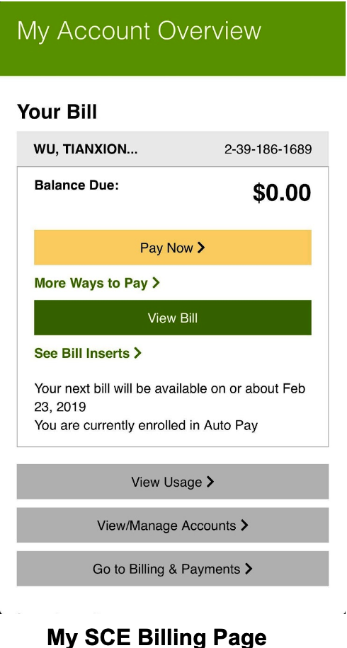
When users try to view the history of statements, the text “View Bill” is underlined and colored in green,
which makes it look like it is
clickable.
We expected some kind of statement document to pop up, but nothing happened when the fake hyperlink is
clicked.
It’s misleading, and violates
usability principles.
Fails to provide easy reversal of actions
Some of the pages failed to provide a way to reverse actions.
For example, When filing outage report, users are presented with a 5-step process with no back/previous
button. If a user
made a mistake in a previous step, the only way to fix it is to click on ‘cancel’ and start over.
Bad interface layout
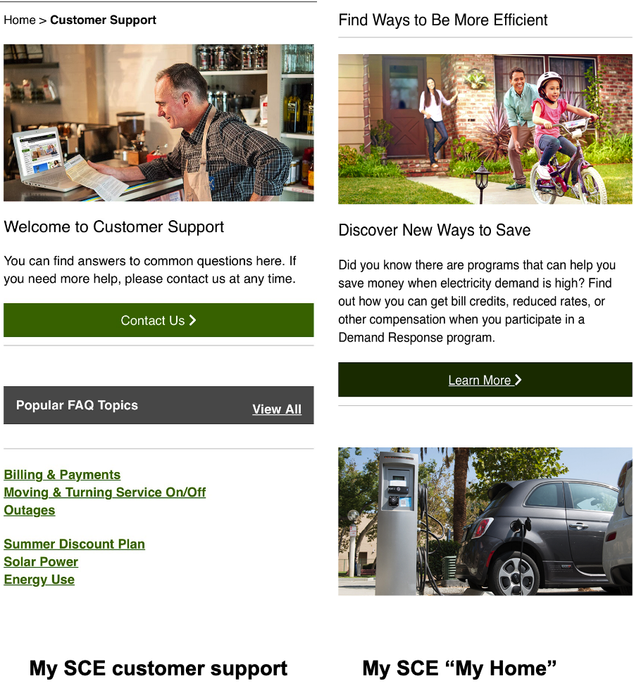
The mobile application has an identical interface as the website. This causes many basic functions,
such as
zooming and going back, to not work at all. In addition, some redundant designs results in
difficult to
access the basic features, and greatly
reduce the user experience.
Some interface components do not appear properly
This problem worsens users’ overall user experience with the app. There are
several places where the inconsistency appears.
Results do not meet the expectation
When users
have trouble finding a feature or don’t feel like navigating through the menu,
the search bar would be a very useful tool in finding the desired page within the app.
The reality of the current
search functionality, however, was far from that. When we typed in the keywords
of a feature we wanted to use, the app simply came up with a
internet-browser-like page with the results from a web search using the keywords
we supplied.


